


THE GLOBAL PETROLEUM INDUSTRY DURING THE SUEZ CRISES
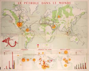
“Le pétrole dans le monde“. Poster by the Union des chambres syndicales de l’industrie du pétrole (the association of trade unions chamers in the French petroleum sector, nowadays “Ufip Énergies et Mobilités“), printed by Impremerie Lafayette in Paris in 1958. Size : 98 x 120 cm.
This remarkable thematic map of the global petroleum industry published after the Suez Crisis, presents a compelling visual portrayal of the oil and gas industry on a grand scale.
The main map provides an overview of the production and transport of crude oil around the world. Regions shaded bright red represent fields “in exploitation”, those shaded green are likely to contain oil reserves, and orange circles and drilling-rig symbols are sized in rough proportion to the output of the major oil-producing countries. Gray arrows indicate the main sea lanes by which crude oil was shipped; using the “flow map” technique pioneered a century earlier by Charles Joseph Minard, the arrows are sized in proportion, more or less, to the volumes of oil transported on each route.
The map’s combination of cartographic elements paints a clear picture: the principal oil-producing countries at the time were the United States, Venezuela, the Middle East, and the U.S.S.R. The latter is shown to possess vast potential territories with crude oil believed to lie beneath the surface, yet production did not fully realize this potential until the fall of the Soviet Union.
Beneath the main map, occupying a strip along the bottom of the overall piece, are two bar charts and three inset maps. The maps focus on the oil-producing regions of Venezuela, North America, and the Middle East, and constitute zoomed-in versions of the larger map. However, some new data has been added in the form of black circles and stars that plot refineries, along with red lines that trace the routes of pipelines.
A chart at lower left indicates how the volume and location of oil production had changed between 1900 and 1956, while a similar chart at lower right demonstrates the growing importance of oil in the overall energy “mix” during the same period (obviously, without modern day “renewables”.) Finally, a small inset map at center left depicts the impact of Egypt’s president Nasser’s closing of the Suez Canal in late 1956 on the global flow of crude oil.
A present-day map of crude oil production would look rather similar: The United States, the Middle East and Russia remain the top oil producers, though Venezuela’s near-total collapse has greatly reduced its role in the market. Conversely, Brazil, China and Norway, among others, which have no presence on this 1958 map, have in recent decades become significant producers of crude oil, while of course Japan, China and the countries of Southeast Asia have all become major consumers.
Price: Euro 1.450,-